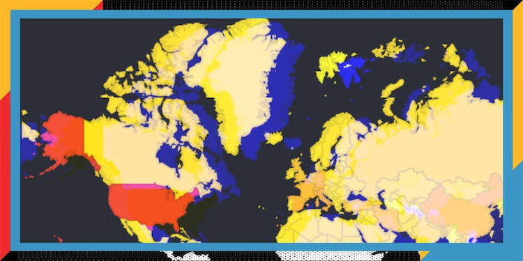
Using Datastudio to Map the CoronaVirus
As misinformation and rumor continues to swirl around the spread of the Covid-19 pandemic, we wanted to create a series of charts to see if it would be possible to identify any previously-unnoticed trends. By combining health data from the WHO, climate data from NOAA, and World Development Indicators from the World Bank, we were able to discover some interesting correlations.
Some Interesting Discoveries —
• America has more coronavirus cases than any other country on earth. However, this is mainly due to the fact that America is larger. Our per-capita case numbers are roughly equivalent to other western countries in Europe and our Corona-related death rate is actually lower than those of developed European nations.
• Many have theorized that warmer temperatures will lead to a reduction in confirmed cases; however, by banding confirmed cases by average temperature, we were unable to identify a relationship between weather and new cases.
• The average mortality rate across all nations is roughly the same, regardless of each country's wealth. If anything, the world's poorest countries are having better health outcomes than wealthier nations. This may, in part, be skewed by the fact the wealthier nations are testing more of its citizens.
•Wealthier nations tend to travel more, which may partially explain why they are seeing higher cases of coronavirus. We can see this across multiple charts, including charts that correlate over-all life expectancy with corona mortality rates.


